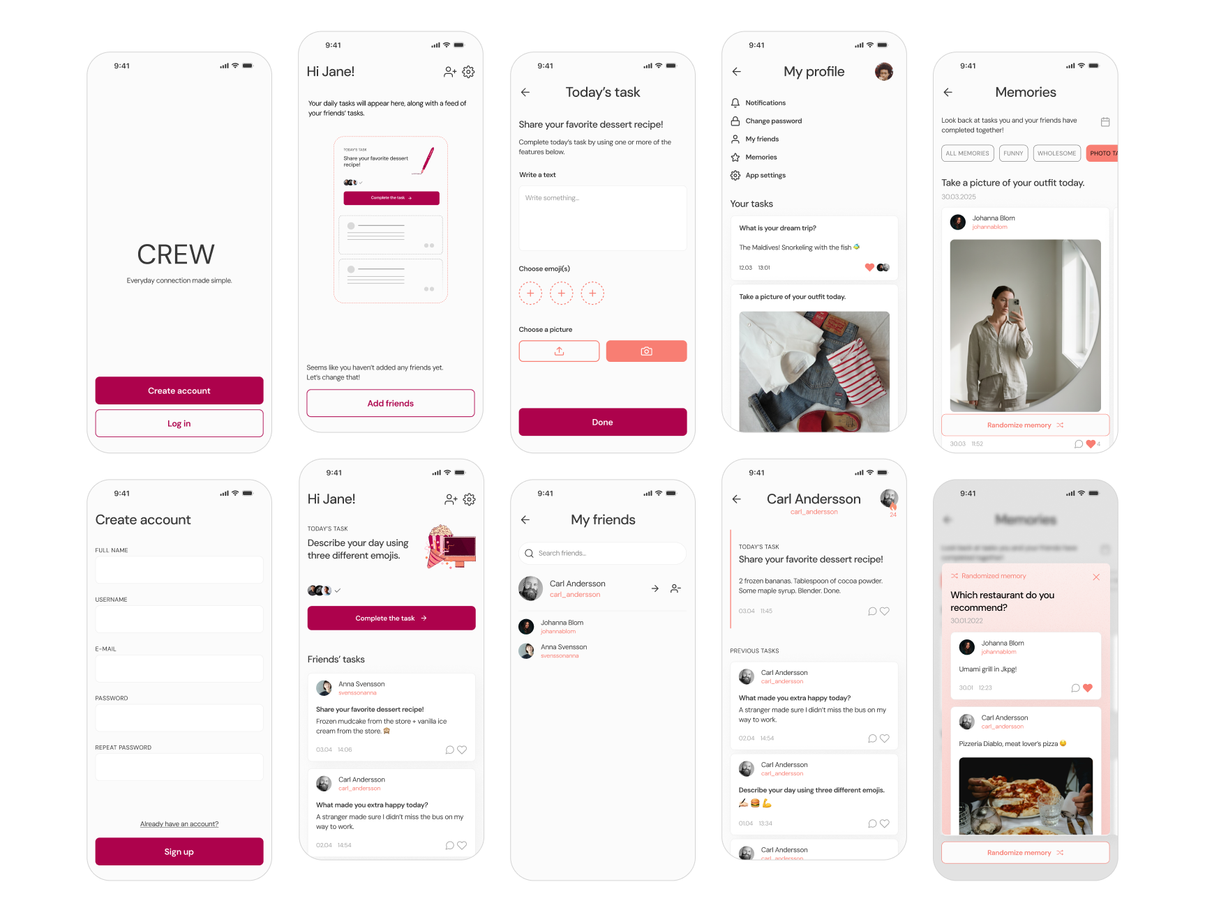
CREW
A private social platform for intentional interaction.



Context
This project was the final part of a university course in interaction design at Kristianstad University, spring 2025. The goal was to create a digital solution focused on “relationship maintenance” — that is, how to maintain good and strong relationships, whether friendship, family, or romantic.
The focus was on the user experience: how people feel when interacting with the digital product, and how we can design for qualities such as meaningfulness, emotional impact, and ease of use. User research included a review of relevant academic literature, and interviews with young adults.
My solution, an app named CREW, helps close friends stay in touch when geographically apart. By completing fun and easy daily tasks together, users stay updated on each other’s lives, helping prevent the fading of important relationships.
My role
Product designer
UX/UI designer
Illustrator
Goals
- Make staying connected feel low-effort, so reaching out becomes a natural habit rather than a task to plan.
- Give users easy conversation starters that stand in for the shared daily context they’ve lost.
- Create a space focused on genuine connection rather than performance or endless content, so friendships stay strong over time.
Process
Research and key findings
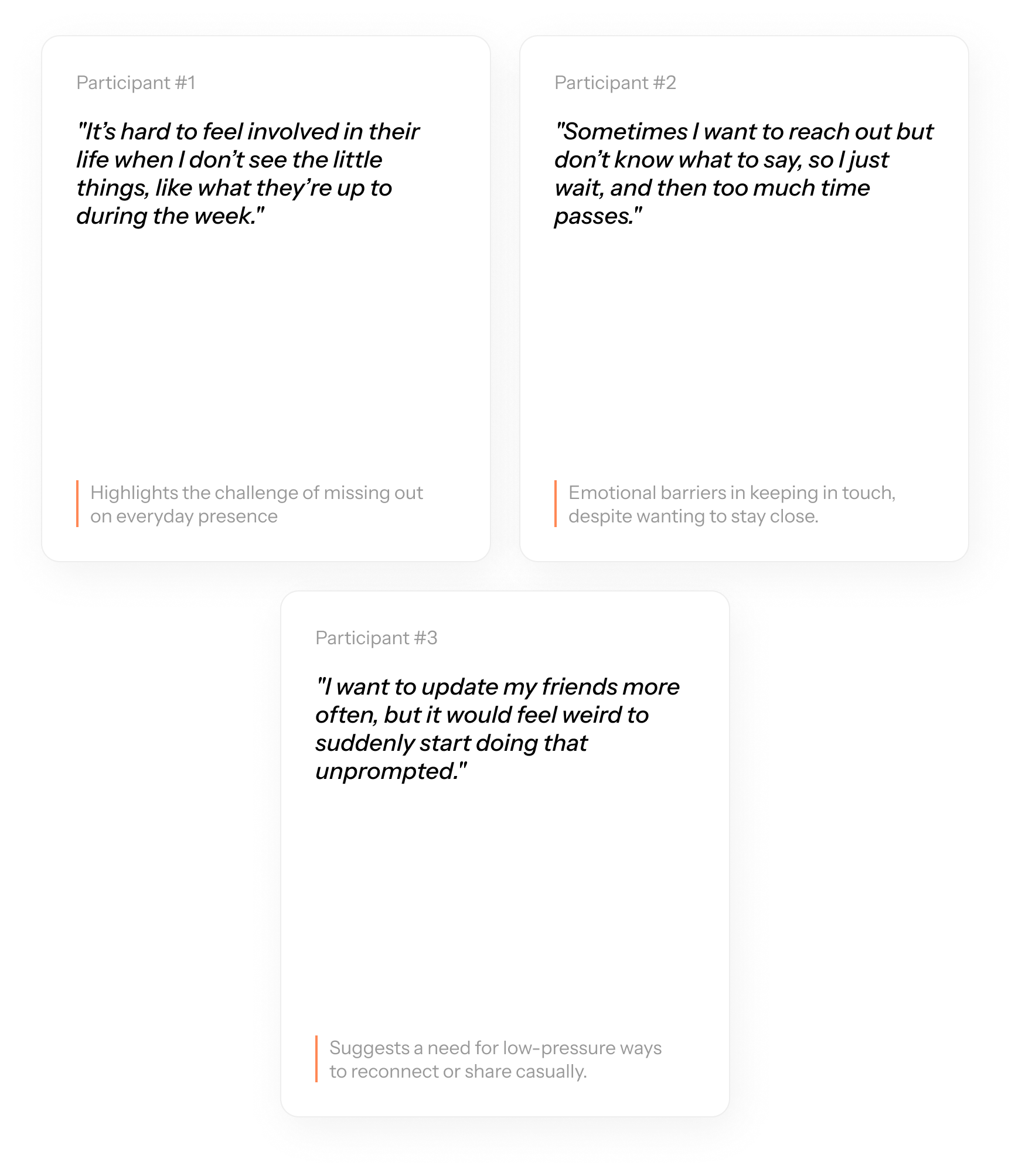
Five young adults were interviewed at the beginning of the course to help establish a foundation for the design direction. At this early stage, the goal was not to test a specific solution, but to explore the broader problem: maintaining friendships while living far apart. The interviews focused on understanding participants’ habits, needs, and challenges related to staying connected with distant friends. Questions were prepared in Notion using a table format with columns for each participant, and notes were taken live during the digital interviews. Below are selected quotes that highlight key insights.
After reading academic research papers and conducting the interviews with young adults (aged 24-27), the following key findings guided this project:
💡 Social media interactions often feel shallow and easily distracted by unrelated content.
💡 Young adults struggle to maintain friendships due to distance and busy lives.
💡 Many feel pressured to share curated or aesthetic content with mixed audiences.
These findings highlight a need for a more intentional, low-pressure way to stay connected with close friends. This shaped the direction of my concept: a lightweight, private app that encourages meaningful daily interactions without the noise or pressure of traditional social media.
User flow and initial sketches
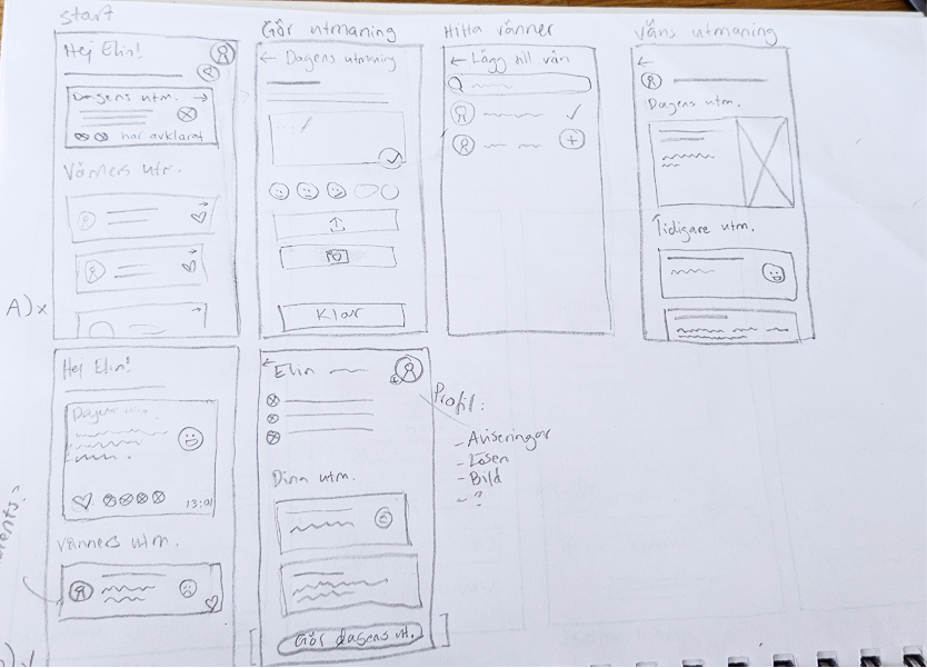
The next step involved generating solution concepts. Several ideas were initially sketched, ultimately leading to a challenge- or game-inspired app concept. These paper sketches were then presented to the interview participants in a follow-up session. Based on their feedback and input on desired features, a user flow outlining key steps and screens was created in FigJam. The paper sketches were then digitized and transformed into wireframes using Figma.


Design choices
The interface was developed with both light and dark modes to ensure high usability in any environment. I selected DM Sans for its modern, minimalist style and legibility across mobile screens. For the color palette, I chose warm oranges and reds specifically to evoke a sense of closeness and comfort, moving away from the cold feeling of traditional social platforms. Illustrations symbolize the type of task, for example taking a photo or writing about something.


Prototype flows
These recordings show three different scenarios: onboarding, completing a task, and the accessibility adjustments between light/dark mode and enlarged text. The screens contain microinteractions for user feedback and a more intuitive experience. Microinteractions were designed to give the user immediate feedback while adding a layer of flair to the overall interaction.
Results
A social space built around user autonomy.
After testing the app with the five participants from previous interviews, and asking them to rank certain qualities, the average result is as follows:
Meaningfulness: 3,5 / 5
Emotional impact: 3 / 5
Ease of use: 4,5 / 5
User testing confirmed that the interface felt intuitive and familiar. While the meaningfulness was quite high, participants offered some vital insights regarding social pressure. They suggested moving away from daily updates in favor of customizable frequencies, for example once a week, and also the ability to create their own tasks. This showed that users clearly prefer an experience they can control, making the app feel more personal and encouraging long-term engagement.
Most testers felt that "streaks" were unnecessary and made the app feel like a chore, preferring gentle reminders over a system that punishes them for missing a day. Similarly, some were unsure about the updates showing “likes”, while some thought it was a good feature to show that you have seen others’ updates. Overall, the project proved that there could be an interest in a more quiet social space, provided the users, not the app, control the pace.