Kalk
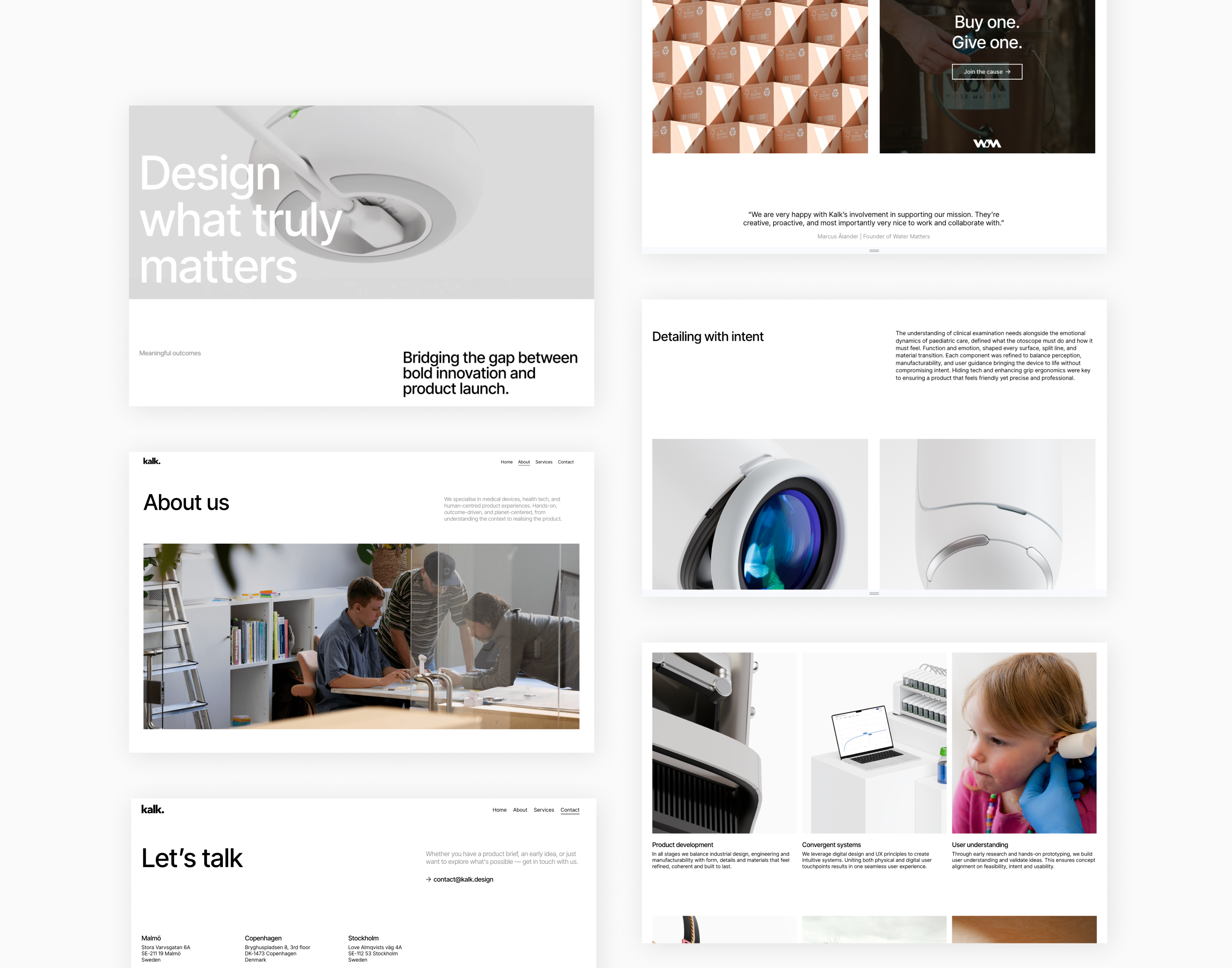
Building the digital presence for a growing agency.




Context
Kalk is a Malmö-based product and industrial design agency working in medtech and life science. During my ten-month internship as their digital design intern, I was tasked with building their new web presence from the ground up.
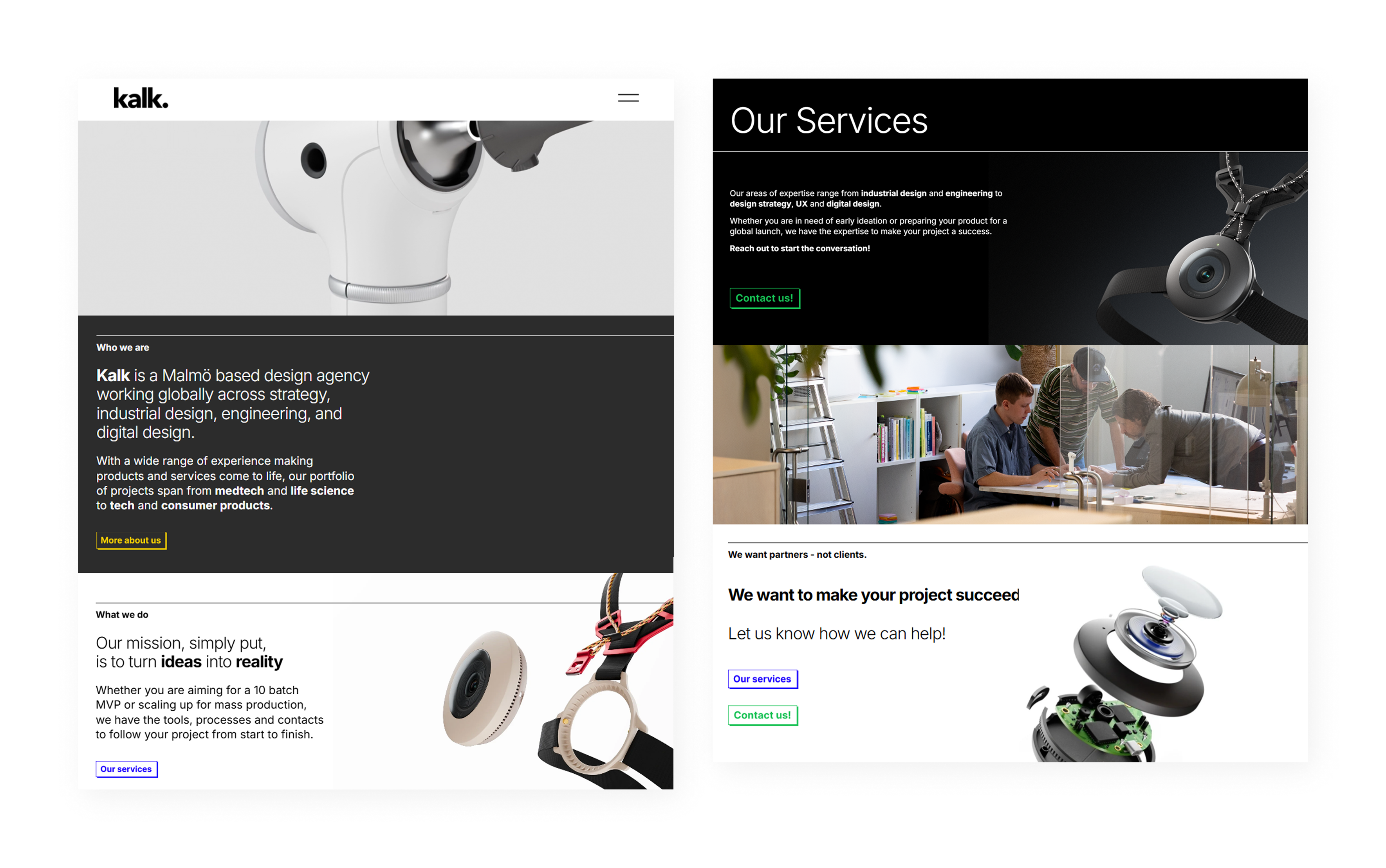
The starting point was a simple Squarespace site with no client work on display. I proposed moving to Webflow to unlock greater flexibility and build a platform that could grow with the agency, while providing a professional stage for our physical and digital design work.
Design and content decisions were made collaboratively with the team, balancing my input with the agency's existing visual preferences and brand direction.
My role
Web designer
Webflow developer
SEO/AEO strategist
Digital design intern at Kalk
Goals
- Showcase Kalk's client work and expertise, which are key trust signals for potential clients in medtech and life science.
- Build discoverability from the ground up, establishing a strong technical SEO/AEO foundation to reach the right clients.
- Establish a visual language that properly reflects the quality and precision of Kalk's physical and digital work.
Process
Audit, planning and strategy
While auditing the old website, a few insights occurred regarding which direction we should go in, both visually and content-wise. The pièce de résistance was the beautiful hero showreel of some of the products created at Kalk - a definite keeper. The rest of the site, however, was lacking in terms of content, only containing a few sentences and buttons to get in touch. The new website should have more, meaningful content, show proper case work, and inspire potential clients to collaborate.
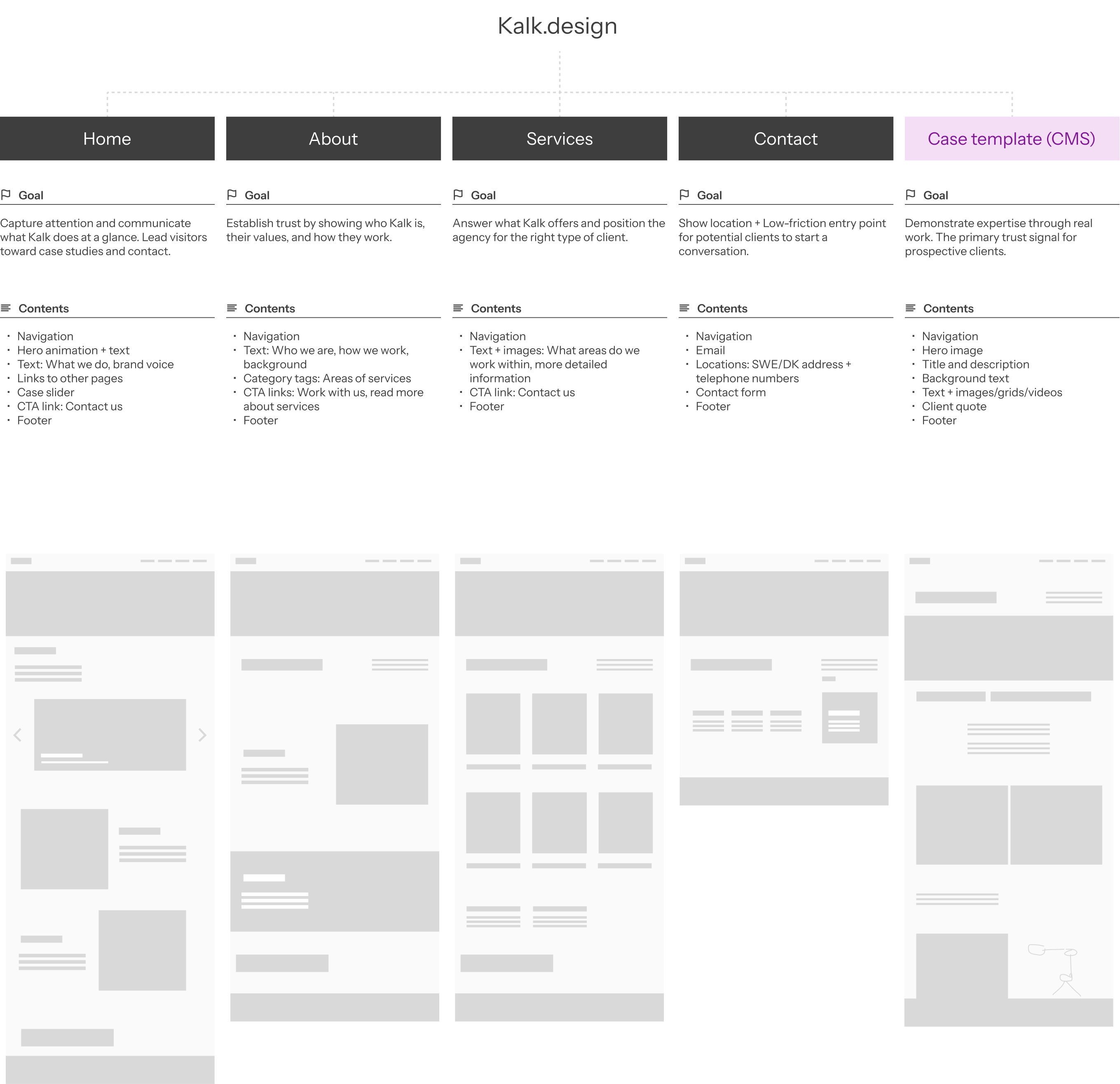
Based on the audit, the team mapped out a content plan for each page, defining the goal and key contents to ensure every page had a clear purpose. From there, I moved into wireframing to explore layout and hierarchy before building in Webflow.
Architecture and style guide
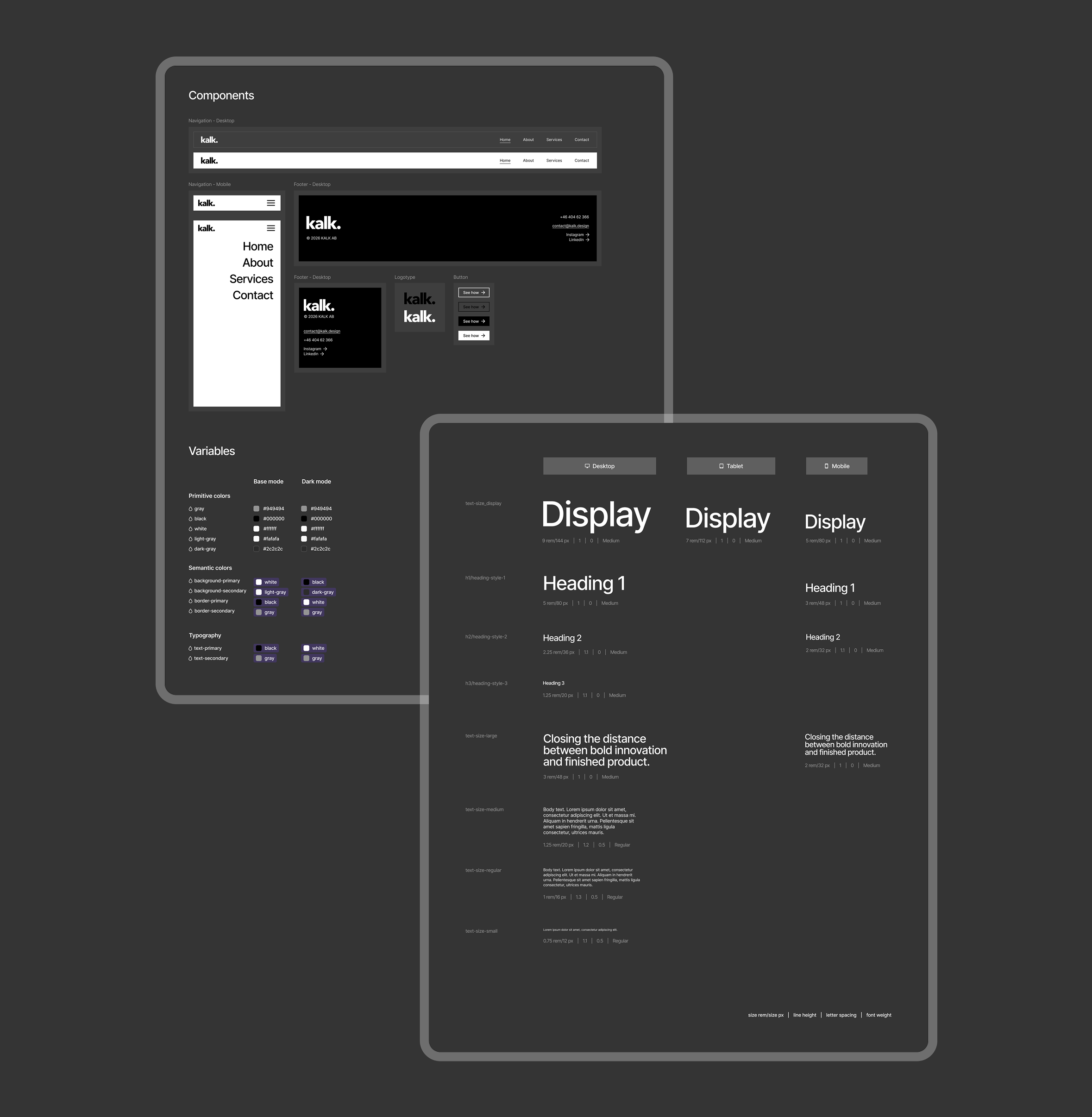
To build a site that could scale and be maintained by colleagues, I structured the project around the Client-First framework by Finsweet — a class-naming convention that keeps Webflow projects organised and handoff-friendly.
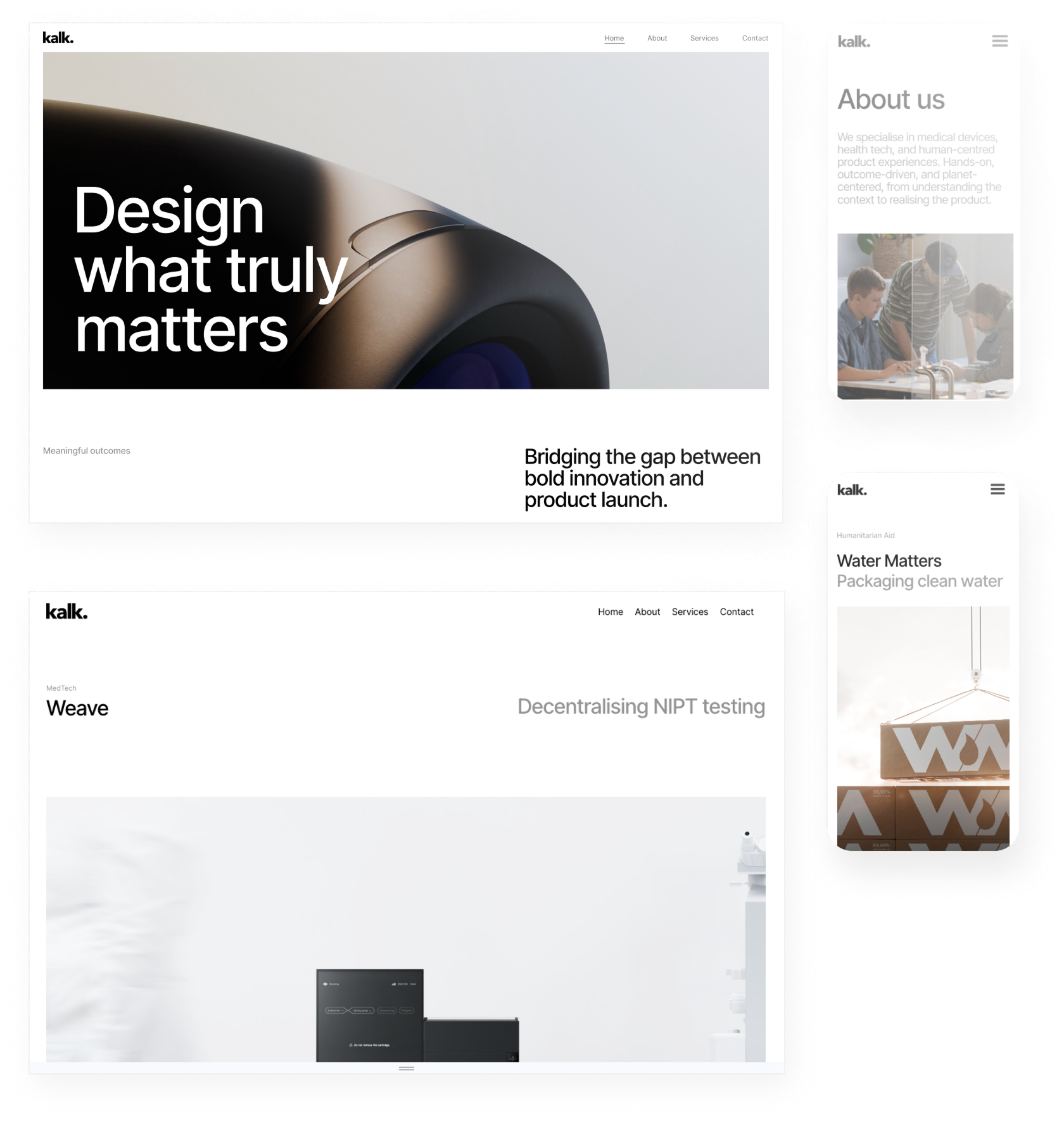
From there I established a typographic scale and recurring layout patterns to create visual consistency across pages. Components like buttons and cards were built for reuse, and variables were set up so that global changes — colours, spacing, type sizes — could be made in one place. Responsive behavior was handled through breakpoints, flex layouts, and min/max widths, ensuring the design adapts cleanly across device sizes.

Case studies and CMS
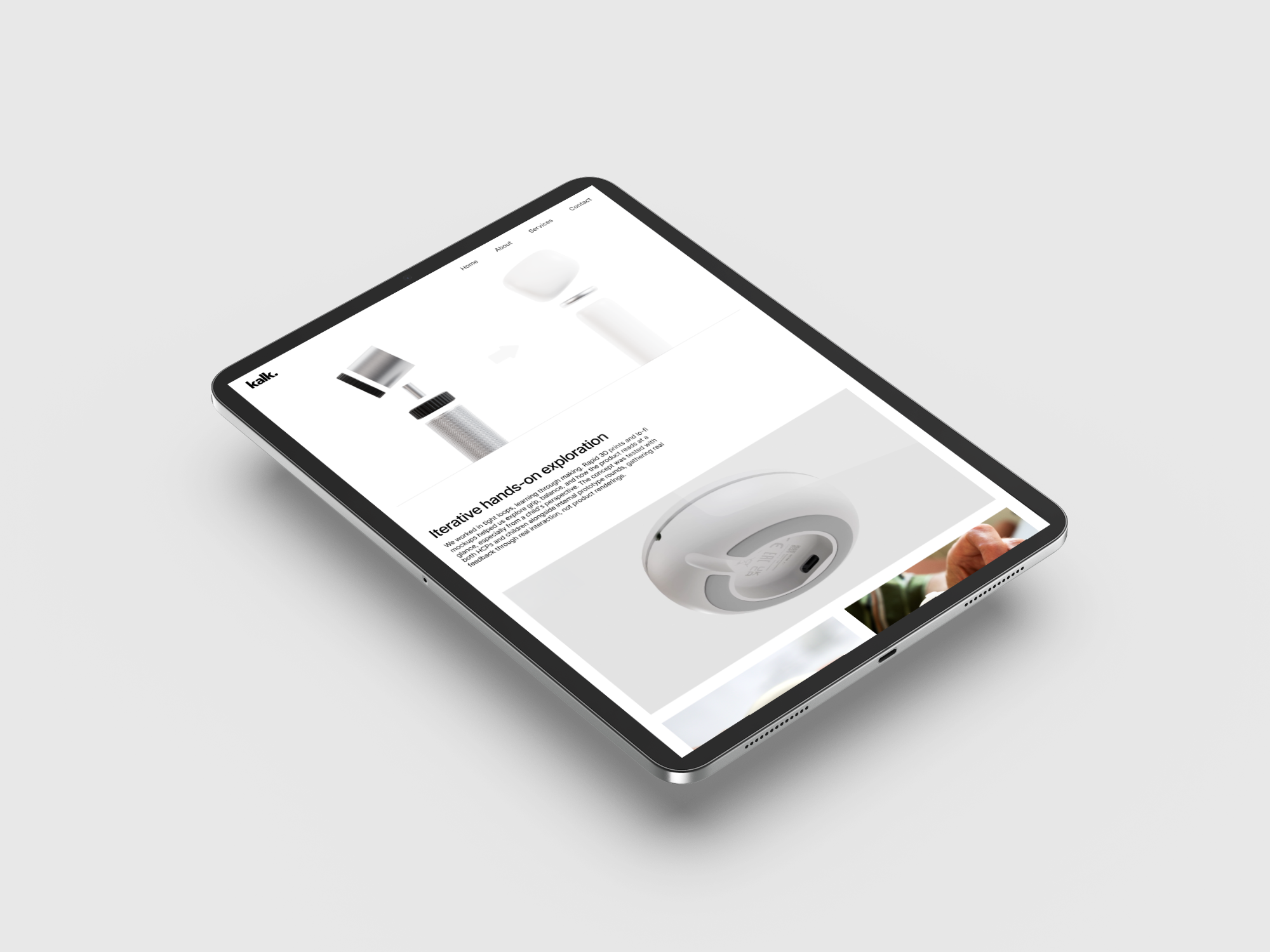
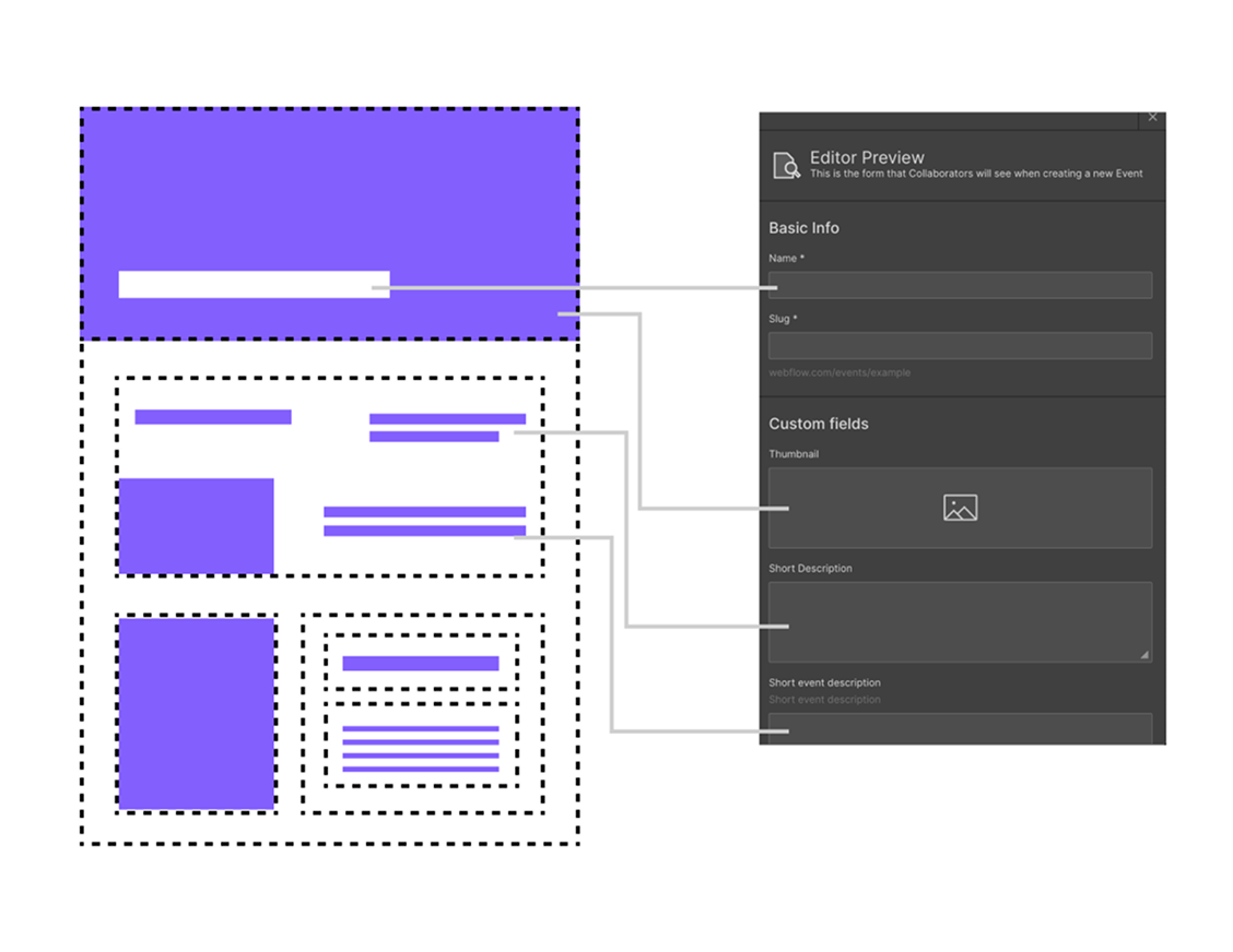
To address the goal of showcasing client work, I built a scalable CMS (Content Management System) in Webflow for detailed project case studies. The CMS fields allow colleagues to build out cases without needing web design skills. New entries in the CMS automatically inherit the layout, styling, and conditional logic.
The core design challenge was balancing consistency with flexibility. The case studies follow a shared template, ensuring visual consistency across the site. For sections where content varies, such as specific media formats or unique project details, I used conditional logic to show and hide elements, giving each case room to adapt without breaking the overall structure. This keeps the brand identity intact while giving each case room to breathe.
Search Engine Optimization
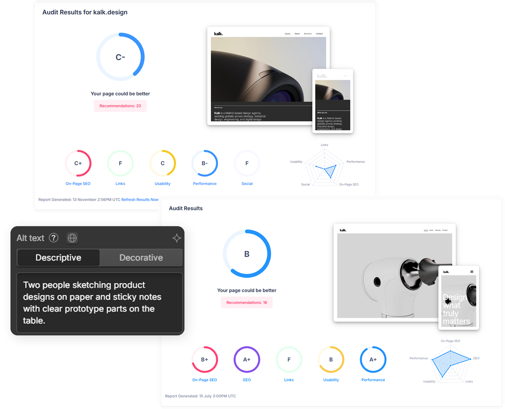
The original website did not have a foundational SEO strategy, limiting its visibility in search results. By implementing custom code snippets, descriptive meta tags, and a semantic HTML structure, the site’s performance rating improved from C- to B according to seoptimer.com. These optimizations helped establishing a much stronger organic presence, especially in AI chat results, as seen in the A+ rating of Generative Engine Optimization (GEO).
Results
A platform ready for what comes next.
The final result is a professional digital presence defined by a clearer structure and a consistent visual hierarchy. By implementing foundational SEO and a scalable CMS architecture, the website is now ready for future expansion and long-term content growth. These improvements ensure that every new case study serves as both a high-quality portfolio piece and a strategic driver for organic search visibility. Visit the website to see it in action!