La Terrazza
A streamlined ordering interface for seamless dining.



Context
This project was completed as part of the Google UX Design Certificate to explore the foundations of product design. The goal was to create a mobile app that makes ordering food faster and more convenient for both takeaway and dine-in customers.
Through user research and journey mapping, the project focused on reducing wait times and making the menu easy to navigate. The final solution, La Terrazza, allows users to browse and place orders directly from their phones, creating a seamless connection between digital ordering and the physical dining experience.
My role
UX/UI designer
Goals
- Ground design decisions in clear assumptions and comparable products, since the project was based on a simulated prompt without live user feedback.
- Creating a single interface that works effectively for both quick takeaway orders and a relaxed dine-in experience.
Process
User research and mapping
The design process started by looking at the needs of a specific fictional user: a student (Alex) living in a new city with a language barrier. Research showed that many customers find it stressful to order food when they don't speak the local language or are in a rush. By mapping out this journey, it became clear that a mobile app could solve these problems by providing a clear, visual menu and a simple way to order without needing to speak to staff. This led to a detailed user flow that mapped out every step a user takes, from browsing the menu to finishing their order.


Wireframing and prototyping
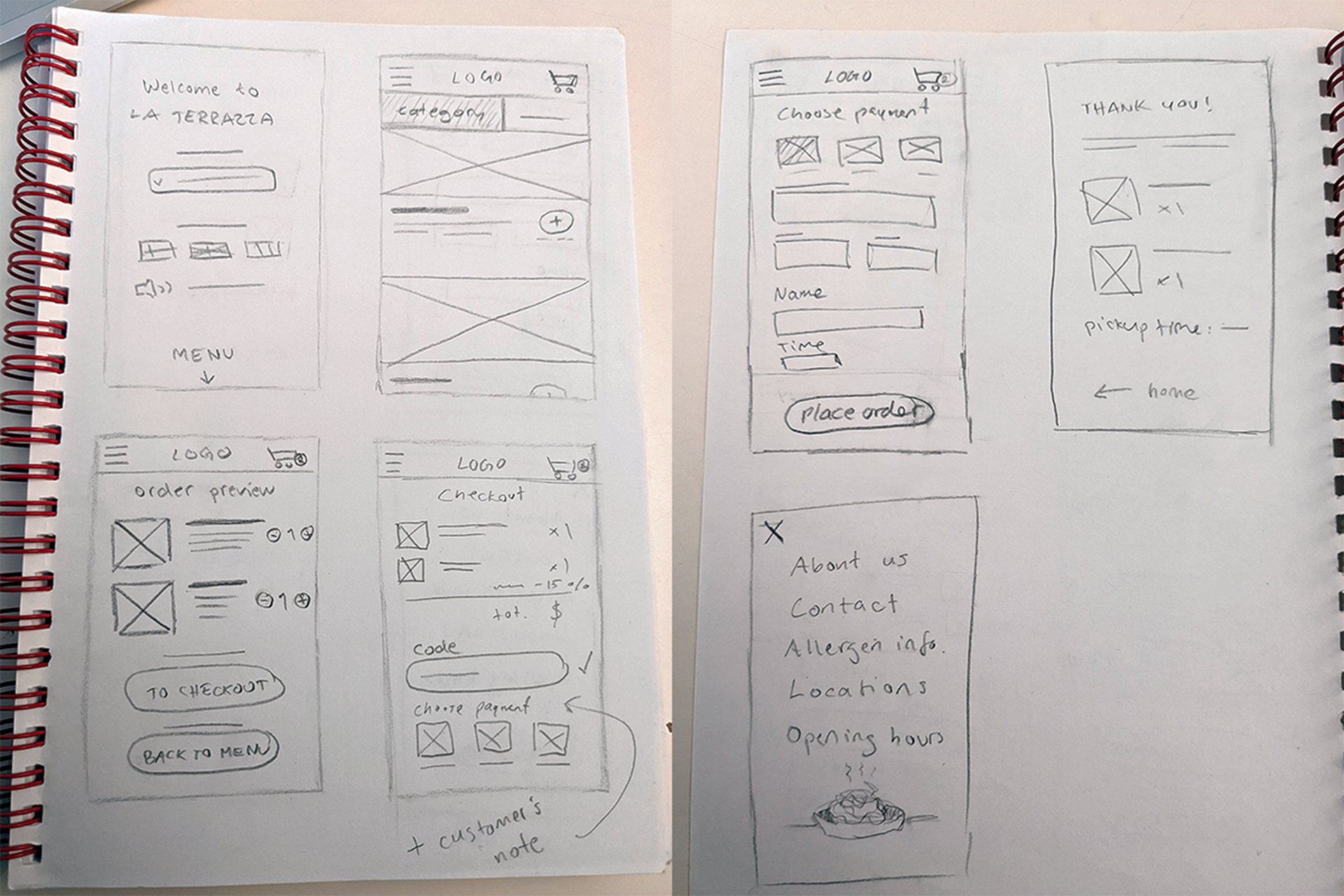
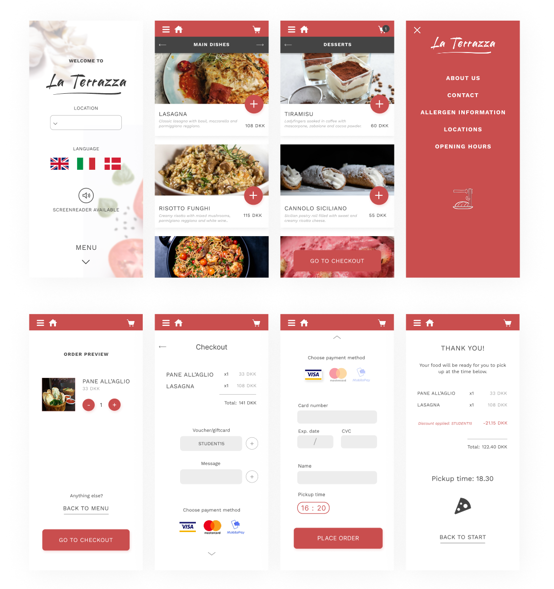
The first step in designing was then to draw some wireframes on paper. These were brought into Figma and refined before making a higher fidelity prototype with additional iterations, and with interactions following the persona’s user flow.

Results
A streamlined dining experience built for everyone.
My goal statement was:
“Our Italian food menu app will let users order Italian food for pickup or dining in, which will affect users who are busy by allowing them to place orders quickly and easily without accessibility issues”.
My persona Alex could easily choose a language which removes a big pain point for them, further on they can add a student discount which was another pain point. For accessibility I chose contrasting colors and the option to use a screen reader. This was an exercise focused on empathizing with users, defining pain points, ideating solutions and creating wireframes and prototypes.
The recording follows my persona's user flow through the app.
