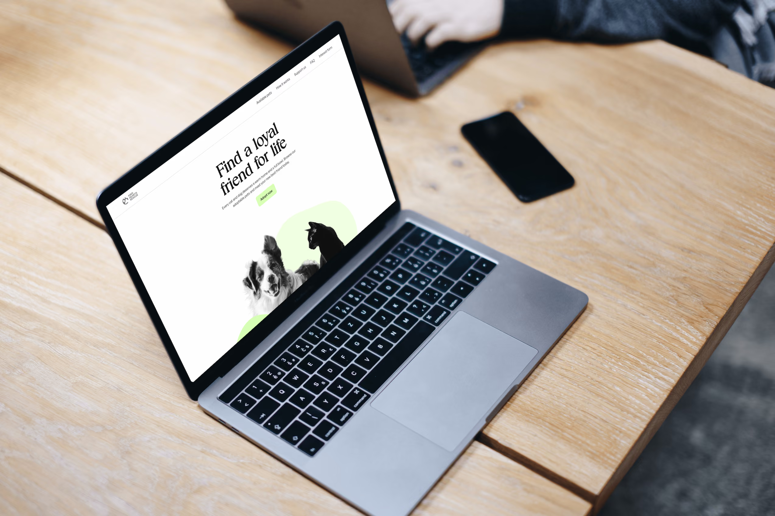
Kind Hearts Rescue
A joyful path from shelter to family.



Context
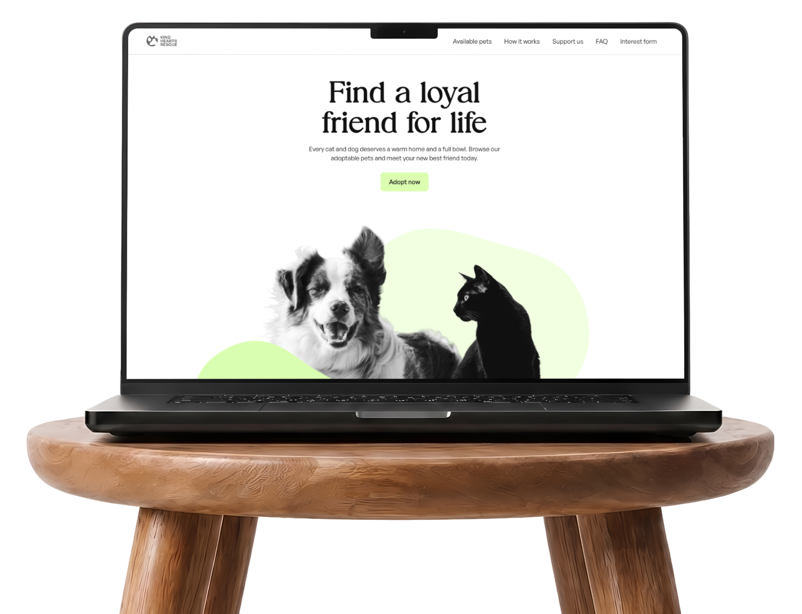
This is a self initiated concept project exploring how a pet adoption website can feel warm and trustworthy while staying simple to use. The client is a fictional animal shelter I named Kind Hearts Rescue. Its cats and dogs and their stories are all fictional, using free images from Unsplash, some AI-generated secondary images (Gemini) and copy created by AI (Claude).
I used the Atom framework and Webflow’s free plan. The site is built from reusable components and a structured content setup, so that in theory staff without design experience could add and update pets and other information themselves.
My role
Web/UX designer
Webflow developer
Goals
- Connect pets with the right people
- Keep the shelter running, through donations and support
- Let staff manage the site without a designer
Process
Research and planning
I began by reviewing five existing shelter and adoption websites to see what they usually feature. Most give each animal a short set of key facts, a longer description and one or more images. They also put a lot of weight on what kind of home the animal needs, who it gets along with and practical facts such as vaccination and sterilization status.
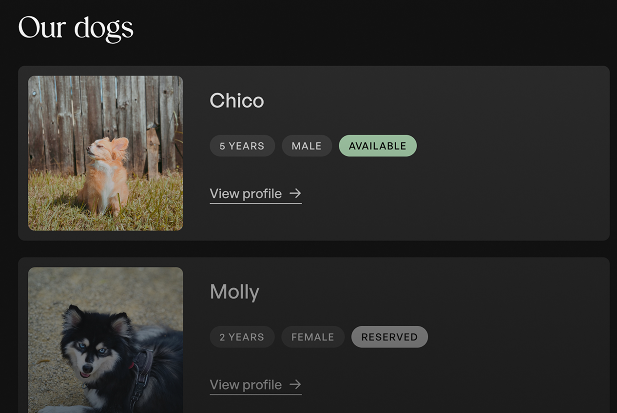
Listings varied in how much they showed upfront. Some showed only a photo and a name and made visitors click for anything else. Others lined up every detail for every animal on one long page. I settled on a middle ground, with a small image, the most important facts as tags and a clear link to a full profile.
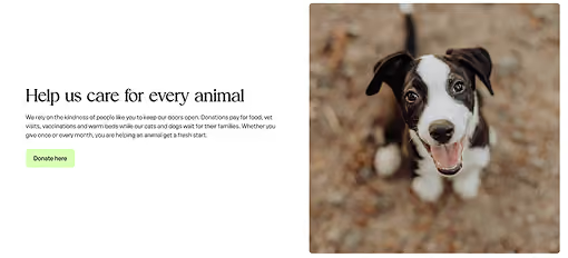
Many shelters also depend on donations, which made a support section a core part of the page rather than an extra. Not everyone can give money, so I looked at other ways to help. Socializing animals that were abandoned or found on the street, walking dogs and fostering for a short period all suit volunteers well, so I included them alongside donations.
Testimonials appeared on many of the sites as well. Stories from past adopters show that adoptions work out and help build trust in the shelter, so I added them too. The sitemaps and wireframes for the pages were made in Relume.
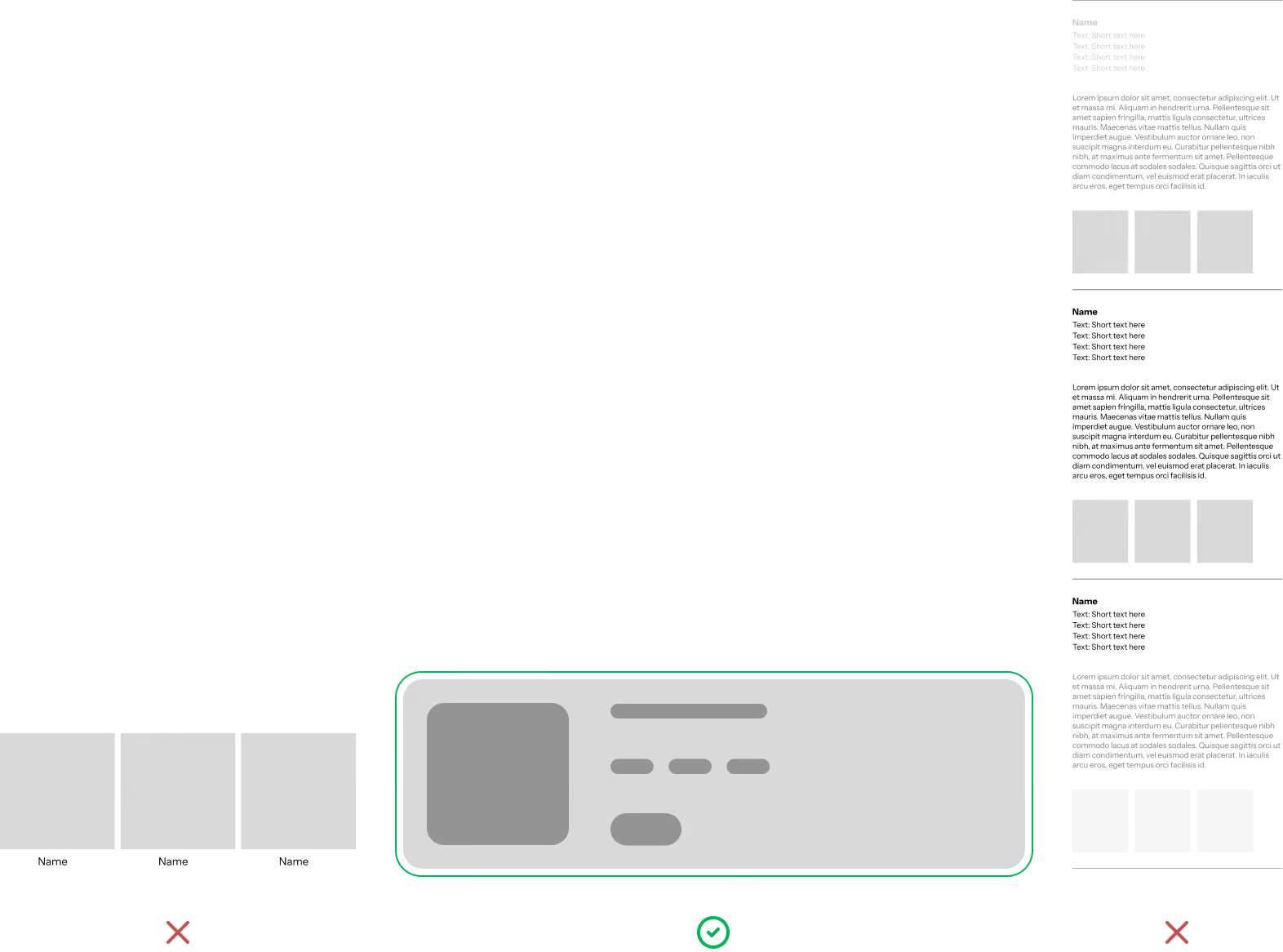
View sitemap and wireframes
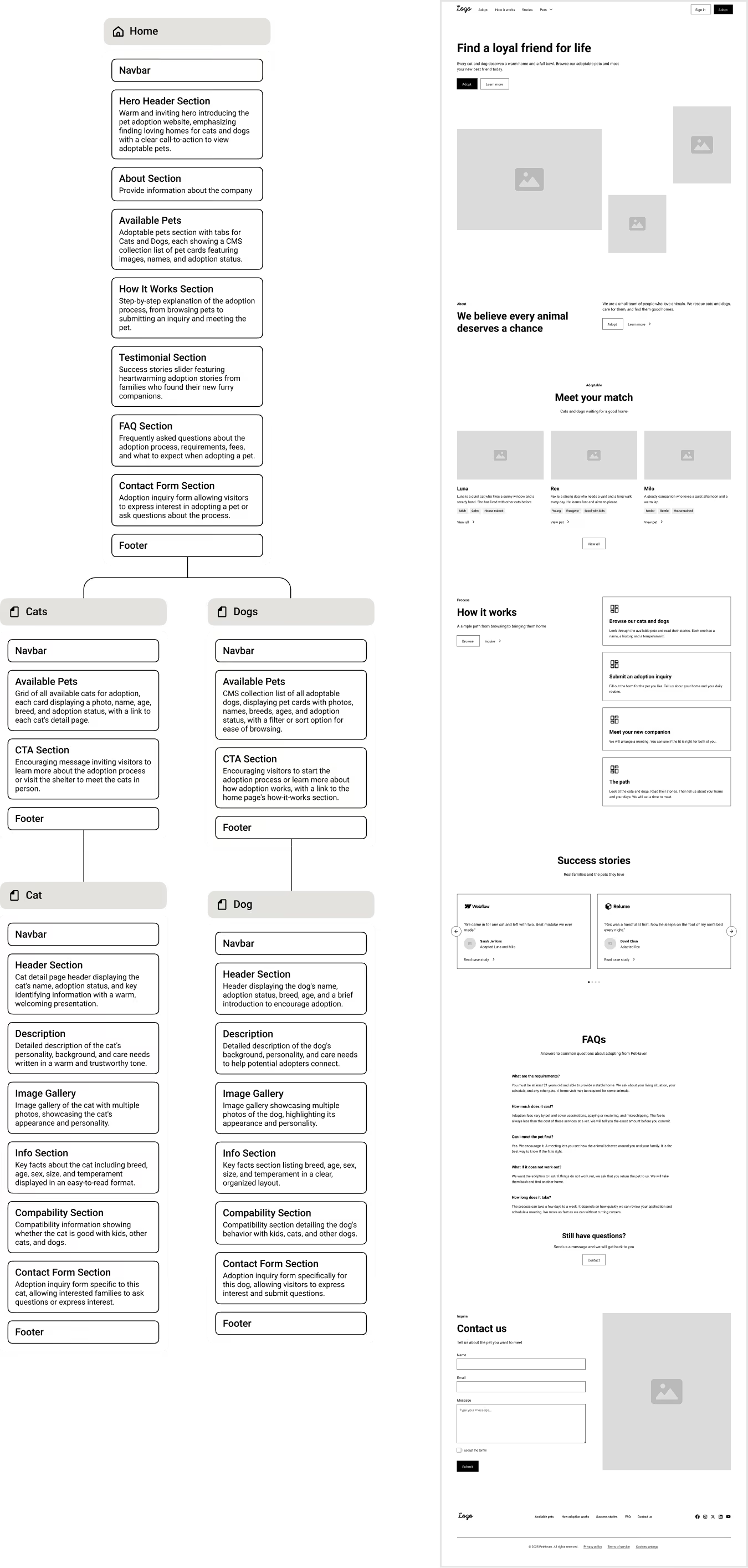
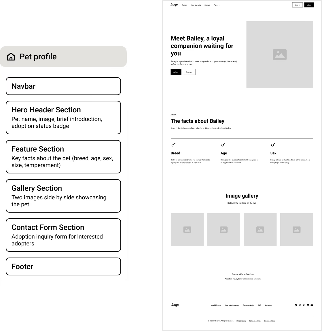
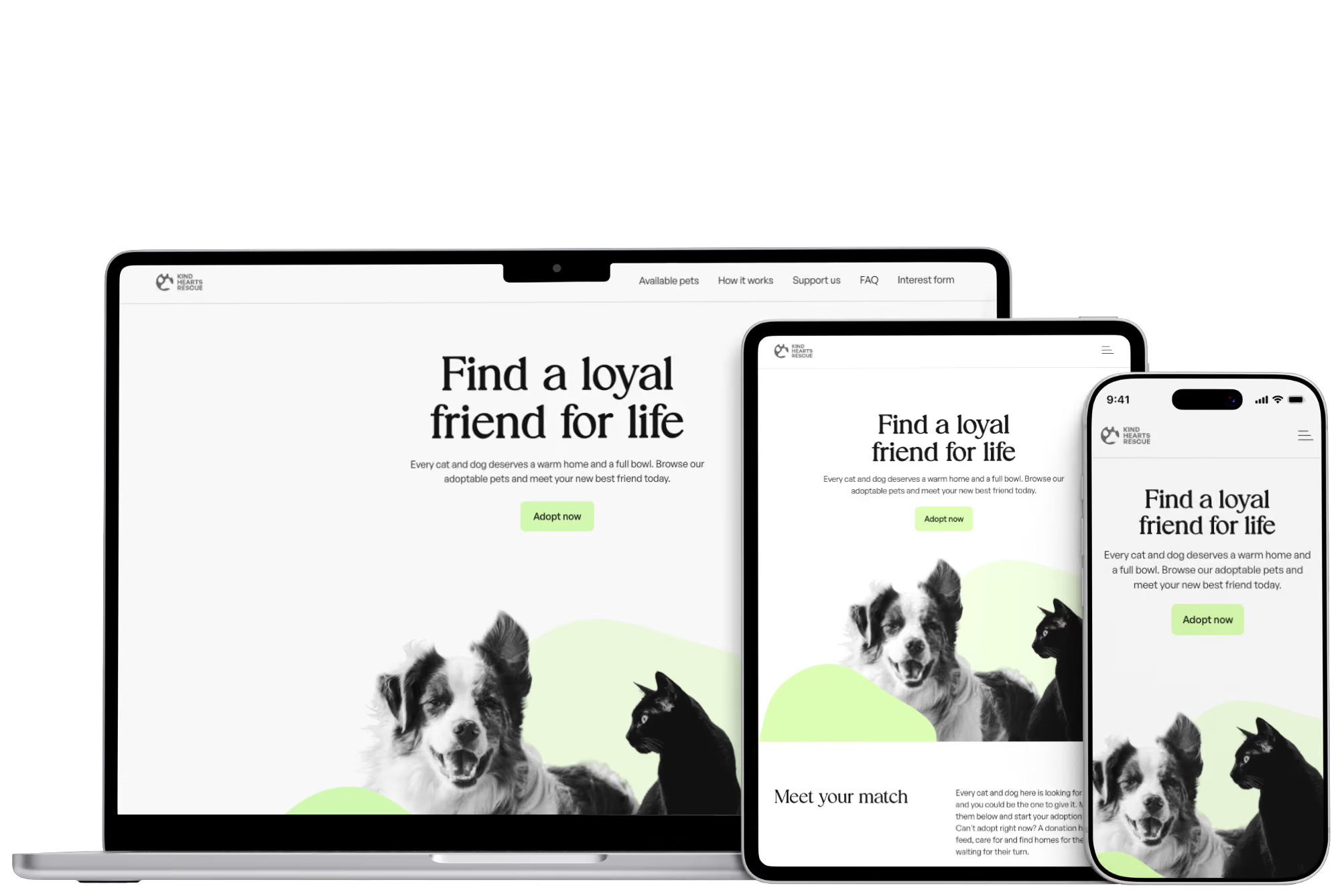
The free Webflow plan allows only two pages, so the site is organized as one scrolling page with a profile template for each species. The main page follows the visitor’s journey from top to bottom: a welcome, the cats and dogs waiting for homes, how adoption works, stories from past adopters, ways to support the shelter, common questions and finally an inquiry form.
Each pet in the overview grids links to a full profile, which keeps the main page light and gives interested visitors the details they need. A sticky navbar and quick snapping between sections keep a long page easy to navigate without causing motion sickness. What began as a restriction ended up making the experience simpler, with everything a visitor needs in one place.
Visual direction
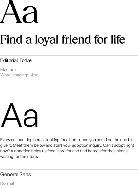
For branding, I went with a clean and classic style, with a touch of playfulness. Editorial Today, a serif with real character, is used in the hero and bigger headings, while General Sans keeps body text and forms easy to read.
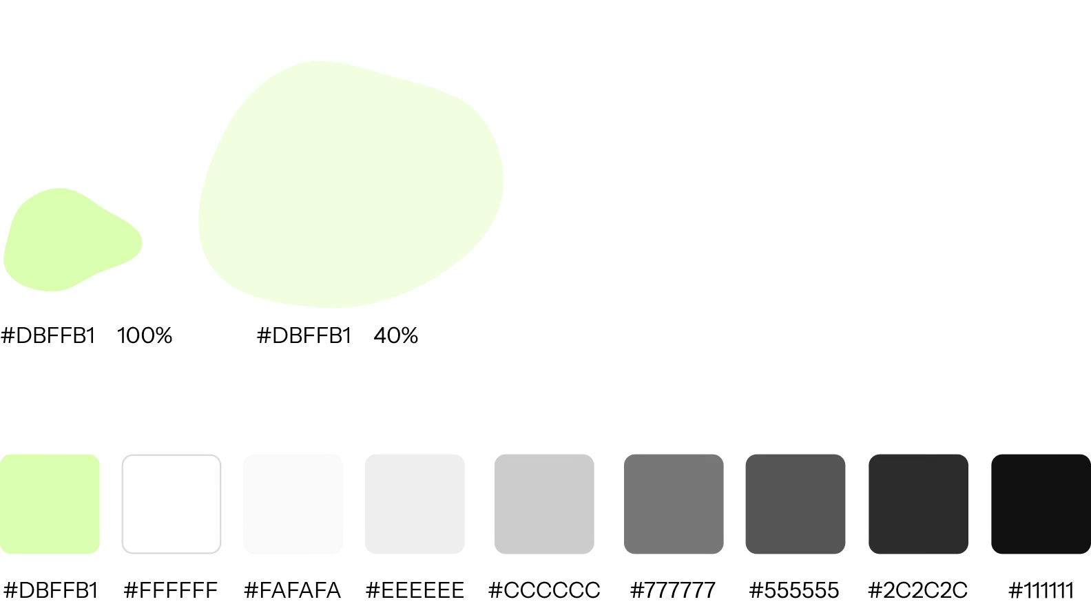
The fresh green brand color brings energy and playfulness along with the irregular blobs in the hero section. White backgrounds and a soft off-black text instead of pure black keep the page calm, and the same off-black is the base of dark mode.
A simple logo, a partial paw print inside a circle, was created to complete the brand but was not a key part of the project.
Webflow style guide
The Atom framework comes with a style guide based on the Client-First framework, which meant the structure for typography, colors and spacing was already in place. Only the fonts and a few colors were swapped, and the existing variables carried the new look through every section.
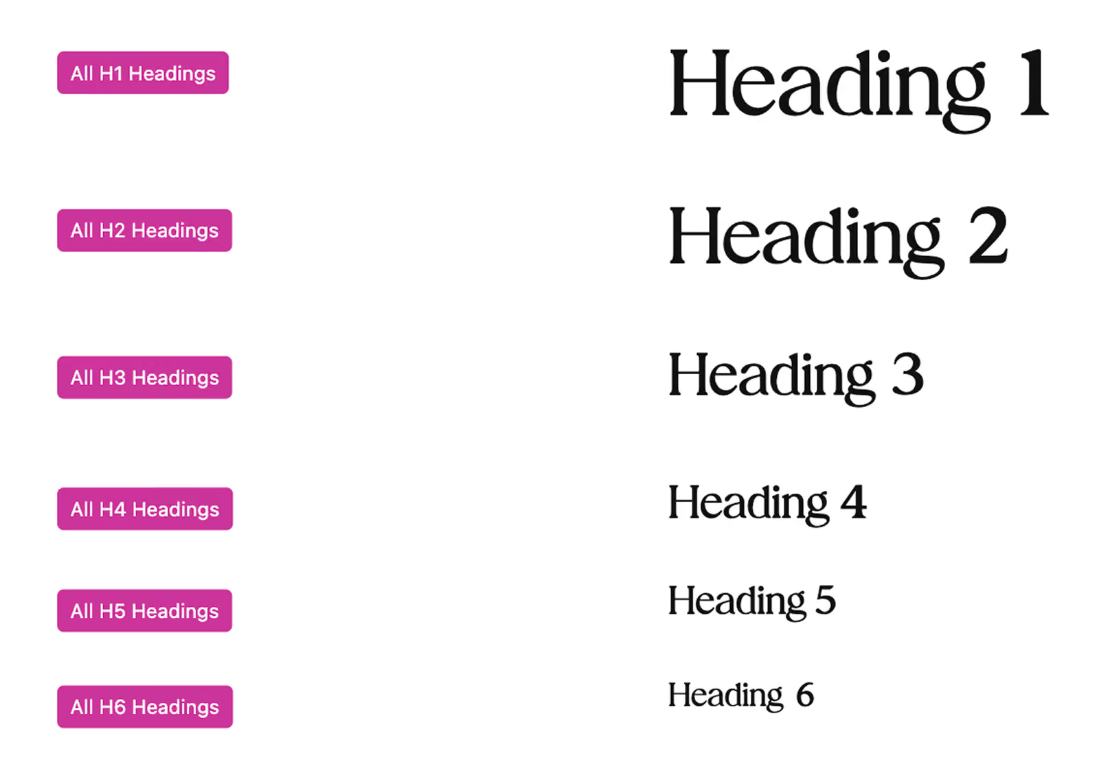
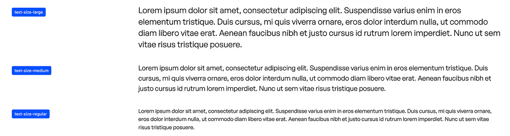
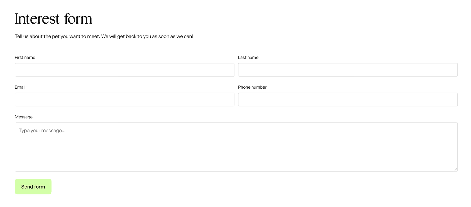
Accessibility features
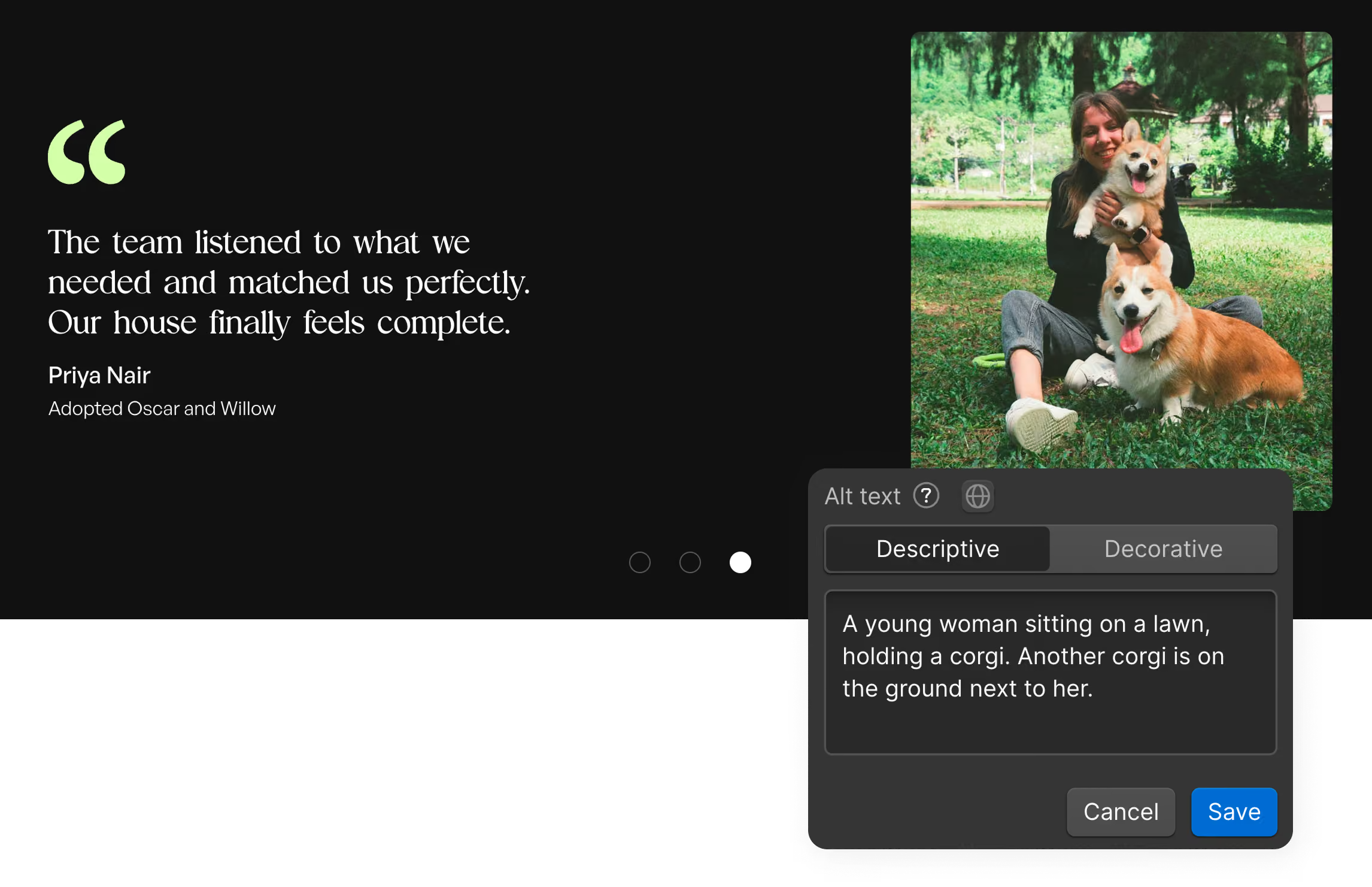
To provide a good user experience for all visitors, accessibility measures were part of the build from the start. Some were already built into the framework, such as dark mode, focus states and fluid sizing. Added considerations include:
- Descriptive alt text for pet and testimonial images
- ARIA labels and landmarks, so sections and forms are announced clearly to screen readers
- Reduced motion preferences respected for the major animated content
- A logical heading structure and semantic section tags
- Sufficient text contrast in both light and dark mode
- Scroll snapping between sections, to avoid motion sickness
Component-based build
Most of the website is built from components in the Atom library, which keeps the design consistent and clean and reduces the need for adjustments at different screen sizes. For a real client, this would make upkeep much simpler. A busy shelter worker who wants to add content can drag a component into place and adjust it with a few simple choices, such as picking a variant, selecting a style or switching elements on and off.
The site also stays consistent as it grows. Updating a component updates every place it is used, and sizes, spacing and colors are connected to shared variables that adapt to the device. Because the look is controlled from one place, new content fits in without breaking the design.
Beyond Atom, a Radiant UI component was used for the adoption process grid, together with a native Webflow CMS grid for the pets and a slider for the testimonials.
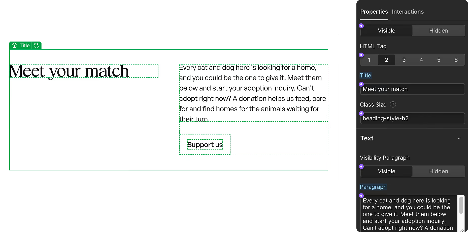
Even grid, Atom
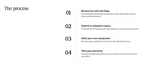
Timeline, Radiant UI
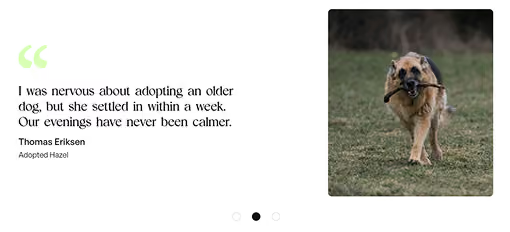
Slider, Webflow

Buttons, Atom
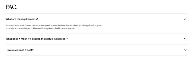
Foldable accordion, Atom
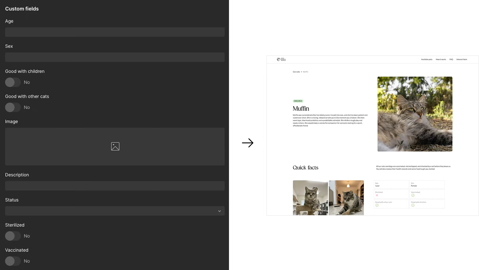
The client fills in information in the CMS. The pet profile pages updates automatically.
Content Management System
The pets are managed through two Webflow CMS collections, one for cats and one for dogs, each with the same fields. These cover practical facts such as age, size and who the pet gets along with, as well as a description, photos and an adoption status of Available or Reserved.
Each collection feeds a profile template, so adding a new arrival means filling in a simple form and publishing. The profile page builds itself in the same layout as every other, with no design work needed.
For a real shelter, this keeps the site accurate with very little effort. When a pet finds a home, one change to the status updates the listing, and visitors never see outdated information. The same fields power the overview grids on the main page, so the details are entered once and appear everywhere they are needed.
Scroll animations and micro interactions
Subtle scroll animations and micro interactions give the page a sense of life without getting in the way. Elements ease into view as the visitor moves down the page, and small responses on hover and click confirm that the interface is listening. Together they guide attention to what matters, such as the pet cards and the calls to action, and make the long single page feel smooth and connected rather than static.
Motion is kept gentle and purposeful, and the major animated content respects the prefers-reduced-motion setting, so visitors who are sensitive to movement get a calm, still version of the same experience.
Results
A welcoming adoption site that serves both pets and the shelter.
The result of this project is a complete adoption website, designed and built using a framework, that guides visitors from browsing to inquiry while keeping the shelter’s own needs in view. Overview grids and detailed profiles help adopters find the right match, testimonials build trust, and a prominent support section invites those who cannot adopt to donate or volunteer.
Reusable components and a structured CMS mean a shelter worker could add a new arrival or update a status without design experience. As a concept project, the site has not been tested with real adopters or shelter staff, which would be the natural next step to see how the experience holds up in practice.